Logos are symbols or other small designs adopted by an organisation to identify its products. We see them everyday, in a number of different environments, adopting the identification of a number of products. How many logos and ads do you set your eyes on each day? On average, most people see about 3,000 advertisements a day! Shop windows, TV adverts, the Internet, billboards, magazines, newspapers, the radio- the list goes on. Logos and advertisements change our attitudes towards things and affects the way we think.
In the modern day, we know hundreds of logos off of the top of our heads and can identify a product or business that it shows off. Humans have the ability to interpret small, simple signs as having more complex and deeper meanings. For example, a thumbs up would be interpreted as a "good luck" or "like" gesture. A red heart would show love and romance- a broken one, the polar opposite. A smile would be associated with happiness.
Advertising has gone as far as using letters, numbers, fonts, colours, shapes and symbols to establish a brand or franchise that can be internationally recognised.
As seen on the right and keeping the colour emotion guide above in mind, we can see the various methods of how companies advertise through their logo:
Advertising has gone as far as using letters, numbers, fonts, colours, shapes and symbols to establish a brand or franchise that can be internationally recognised.
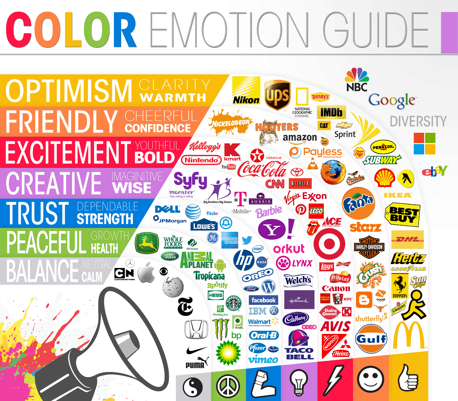 |
| A "Colour Emotion Guide" showing us the connotations of our basic colours and how they are represented through logos. |
- Letters: You see a golden M and you know it stands for McDonald's.
- Numbers: Popular with sports teams and TV and Radio channels. Film 4 uses its number in its logo.
- Fonts: The famous signature of Walt Disney.
- Colours: The colour purple is heavily associated with the chocolate company Cadbury.
- Shapes: The Olympic Rings, simple logo but internationally recognised.
- Symbols: Whether you've read the comics, seen the films or TV series, or laughed at geeks in his costume, the Batman needs no introduction.

By taking a look at some of the world's most famous brands and logos and understanding what makes them easy to recognise, we can then go onto questioning it. Why is that colour used and what does it represent? ; how does that font used support the colours and symbols used in the logo etc. This is called Semiotics. Semiotics is the study of signs and symbols and their use or interpretation. It is an important tool in Media as it helps us read logos, texts and other advertisements analytically.
Ferdinand De Saussure is one of the founding fathers of semiotics, which he called Semiology. His concept of the sign/signifier/signified/referent forms the core of the field. Saussure states that we read signs and symbols in three steps.
 •Sign
– We
see the actual thing.
•Sign
– We
see the actual thing. The word ‘film’ is a series of lines or marks.
•Signifier – We interpret what it is.
We see that these lines or marks form the word ‘film’.
•Signified – We recognise what it means.
The word "film" refers to a story/event shown through a camera in a set of moving images of which we watch on a screen.
Roland Barthes, a later semiotician used a similar theory:
•Sign – A red rose.
•Denotation – We imagine a particular flower or colour.
•Connotation – We attach a deeper meaning, such as romance or passion.
Semiotics
is a useful tool to use in the topic of Media because it allows us to take into
account all factors that make up an attractive composition of a movie poster whether these be the title, main image or the content of the cover lines.
Using Semiotics we can understand the connotations and denotations of each
variable or symbol, and how we can use these to attract our target audience in
a subtle way. With these methods of analysis, we can predict what a film will be about, what type of characters might be in it and other aspects just by looking at an image, title and its font.
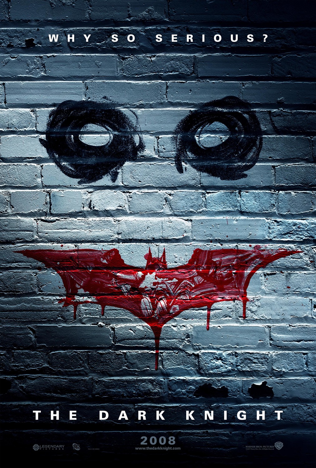
 At the top of this poster is the tagline "Why So Serious?" in bold letters. This peculiar line makes little grammatical sense but we assume that it has significant relevance to the other features seen on the poster. At the bottom we see the title of the film "The Dark Knight" in the same font in a bigger size. While it can be said this font doesn't not give us any idea as to the plot, nature or characters of the film, it does remain consistent with the previous film in the series. The bold characters which make up the text make us believe that is has importance but is deliberately small as the image is the main feature of the poster. It is an image of a wall which appears to have been painted on. This has denotations of graffiti and street art which has further connations of crime and anarchy. The brick wall of which has been painted on suggests the film will be set in an urban environment. The painting itself depicts two circles in black and the Dark Knight logo in red with a white background. The black circles resemble dark eyes with the red Batman logo acting as a pair of bloodied lips. With these two features implying the image is of a face, the white background acts as the pale skin of this face. An artist spends years perfecting a masterpiece on a canvas but here we get the impression the artist didn't care if it looked messy. In fact, we must believe it has been done this way on purpose to give off a sinister and scary theme. The messy nature of the image (ie. the paint dripping having striking connotations of blood and unsymmetrical shape of the circles) reflects upon the characteristics of this person. Of course, this is the face of the infamous super villain and arch nemesis of Batman, The Joker- his tagline: Why So Serious? The Joker in this film is portrayed as an evil, ingenious psychopath, who wears makeup to exemplify his childhood scars around his mouth and terrorises the city of Gotham. But even if we didn't know that, the poster allows us to make accurate guesses about the film. Using the poster, we assume the film is of a crime/psychological genre with much emphasis and importance put on the scary antagonist shown in the image. With a title like "The Dark Knight" we believe there to be themes or features in the film including murder, crime, fighting, heroism, evil and philosophy. We can even make further assumptions that the target audience for the film would be males between 18-35.
Orphan (2009)

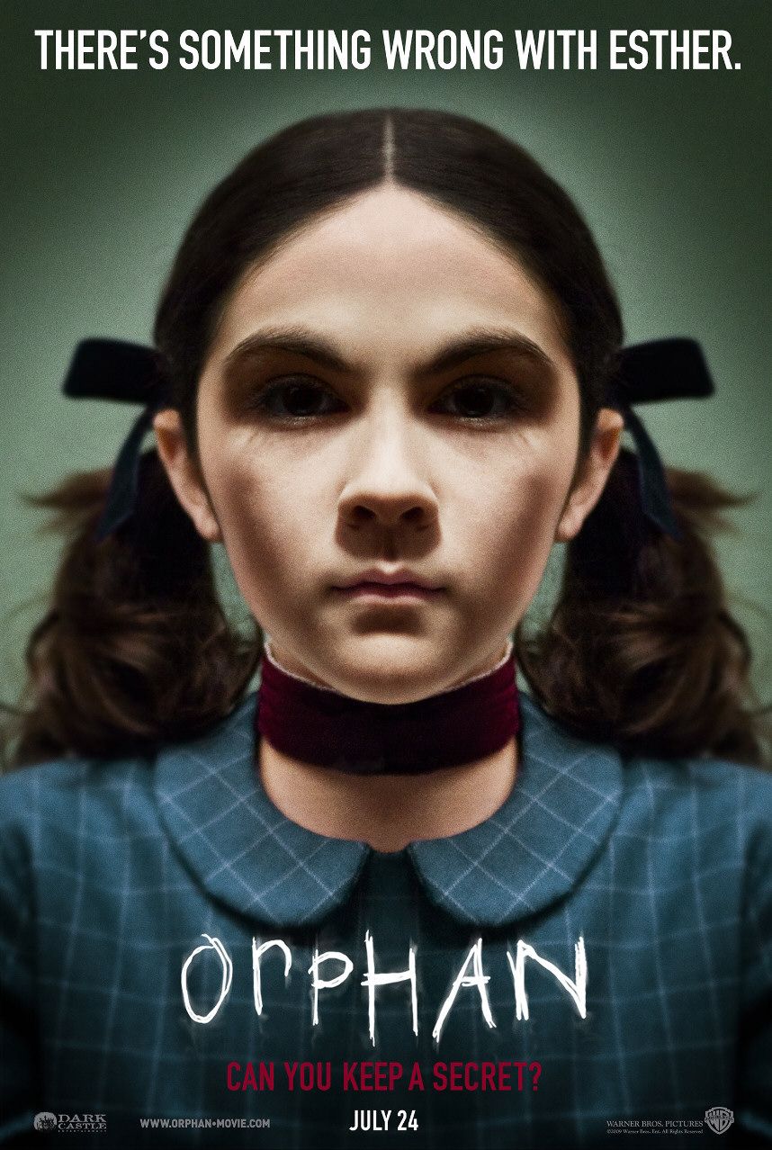
The font of the title used in the poster appears to be a series of scratches in the form of the word "Orphan". The title is actually a mix between uppercase and lowercase letters implying the author (possibly this girl in the image) is not a sophisticated or experienced scribe. These scratches imply that something sharp such as a knife or blade may have carved lettering like this. We can guess that the girl in the image is the orphan which leads us to many questions. Why is she an orphan? What is her background like? How old is she? The tag lines seen in white and red at the top and the bottom of the poster read "There's something wrong with Esther." and "Can you keep a secret?". These give us the name of the orphan girl seen in the image and also supply us with the idea that she isn't normal. "Can you keep a secret?" appears to be significant as it is written in red font. These lines on the poster gives off the senses of uncertainty, secrecy and deception which could be themes in this film. The taglines are all capitalised and in tall, bold writing. From this, we can tell these are memorable lines said in the movie. The red lettering and the red neck tie connotate with danger, blood, warning and death.If they didn't give us a spooky enough feeling the picture definitely does. The image shows "Esther" as a young girl emphasised by her pony tails. She is wearing blue ribbons in her hair with a checkered round collar shirt and a neck tie. This isn't the most fashionable set of clothes for a 9 year old girl in the 21st century. The blue colouring can be associated with feeling such as coldness, sadness and intimidation. Usually, we depict children to be sweet and innocent but rather chillingly, we cannot see "Esther" as this from the poster. With the descriptive taglines and the shadowing over her face, she appears to be possessed or demonic in some way. She is staring straight at us making us seem like her victim.We can confidently assume that this is a horror film targeted at those 18 years old and above.
 This poster immediately gives us an idea of the genre of the film. We immediately believe this film to be a story about a pair of burlesque dancers with music being a large theme.. The font of the title is very large, capitalised and straight down the middle of the poster. This could be seen as reflecting burlesque dancing as a bold, glamourous and vivid occupation. The font is red giving off associations such as love and romance which matches with the seductive red lips and burlesque theme. The glistening lights on the letters further emphasises the bar/show theme of the film. However, we notice that some of these lights are not lit up leading us to feel that there may be a problem in the film and not all will work out as planned. This is a common narrative structure seen in lots of films. We see the smaller red font saying "It takes a legend ... to make a star." It gives us a clue as to what will happen in the film. This suggests that the women on the left is famous in the film and is older, possibly wiser than her counterpart of the right. This difference is emphasised by the black and white colouring on both sides. The white faces and red lips seen have similar imagery of that of Marilyn Monroe, a famous actress, dancer and sex symbol from the 1950's and 60's. With these connotations we can safely assume that this film is aimed at younger and middle aged female adults with musical stars such as Cher and Christina Aguilera playing the two main characters.
Using the theories by Saussure and Barthes tested on recent film posters, along with the evidence that letters, numbers, fonts, colours, shapes and symbols can be used to establish a brand, logo or franchise, I can now apply this to my own media company and its products.
The Dark Knight (2008)
Orphan (2009)
The font of the title used in the poster appears to be a series of scratches in the form of the word "Orphan". The title is actually a mix between uppercase and lowercase letters implying the author (possibly this girl in the image) is not a sophisticated or experienced scribe. These scratches imply that something sharp such as a knife or blade may have carved lettering like this. We can guess that the girl in the image is the orphan which leads us to many questions. Why is she an orphan? What is her background like? How old is she? The tag lines seen in white and red at the top and the bottom of the poster read "There's something wrong with Esther." and "Can you keep a secret?". These give us the name of the orphan girl seen in the image and also supply us with the idea that she isn't normal. "Can you keep a secret?" appears to be significant as it is written in red font. These lines on the poster gives off the senses of uncertainty, secrecy and deception which could be themes in this film. The taglines are all capitalised and in tall, bold writing. From this, we can tell these are memorable lines said in the movie. The red lettering and the red neck tie connotate with danger, blood, warning and death.If they didn't give us a spooky enough feeling the picture definitely does. The image shows "Esther" as a young girl emphasised by her pony tails. She is wearing blue ribbons in her hair with a checkered round collar shirt and a neck tie. This isn't the most fashionable set of clothes for a 9 year old girl in the 21st century. The blue colouring can be associated with feeling such as coldness, sadness and intimidation. Usually, we depict children to be sweet and innocent but rather chillingly, we cannot see "Esther" as this from the poster. With the descriptive taglines and the shadowing over her face, she appears to be possessed or demonic in some way. She is staring straight at us making us seem like her victim.We can confidently assume that this is a horror film targeted at those 18 years old and above.
Burlesque (2010)
Using the theories by Saussure and Barthes tested on recent film posters, along with the evidence that letters, numbers, fonts, colours, shapes and symbols can be used to establish a brand, logo or franchise, I can now apply this to my own media company and its products.
No comments:
Post a Comment